Chart Types
SurveyJS Dashboard visualizes survey data using different types of charts. This help topic gives a brief overview of the chart types included in the library. Each description includes illustrations and a list of supported question types.
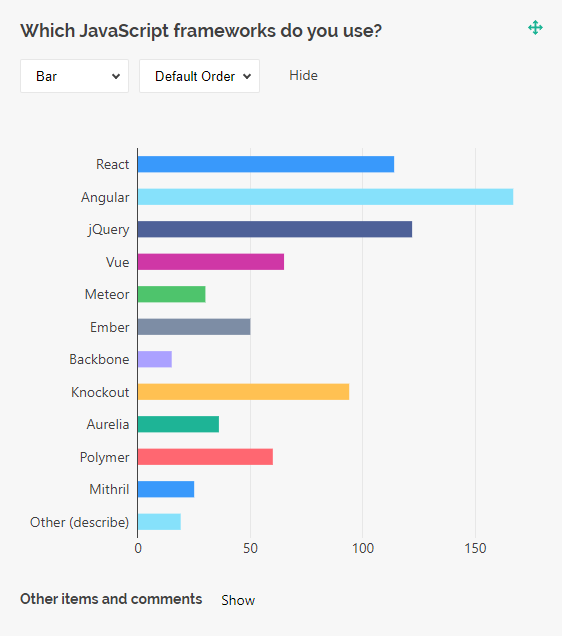
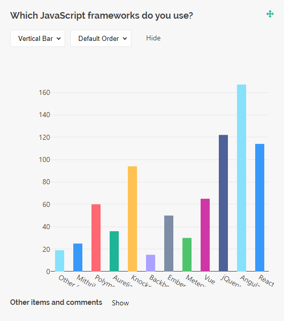
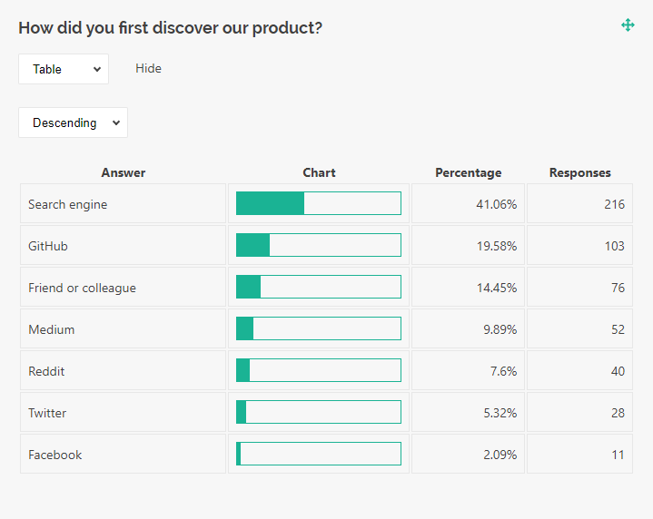
Bar Chart
A bar chart visualizes categorical data with rectangular bars. The length of each bar is proportional to the value it represents. SurveyJS Dashboard supports vertical and horizontal bar charts.
Bar charts are supported by the question types listed below:
- Radio Button Group
- Checkboxes
- Dropdown
- Multi-Select Dropdown (Tag Box)
- Image Picker
- Yes/No (Boolean)
- Single-Select Matrix
- Ranking
- Any of these question types used within a Multi-Select Matrix, Dynamic Matrix, or Dynamic Panel
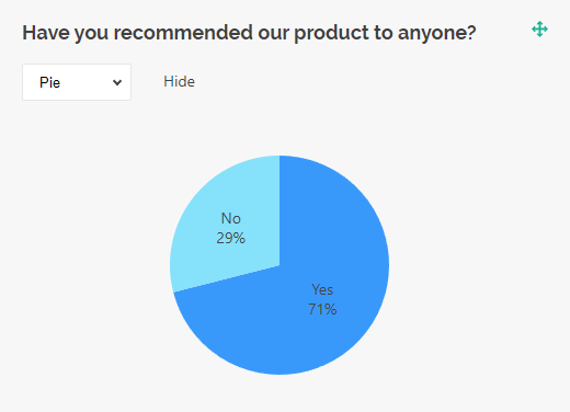
Pie Chart
A pie chart is a circular graph divided into slices that represent proportions of a whole. Pie charts are great for visualizing how each category contributes to a total. They work best with fewer categories because a bigger number of slices can make chart interpretation difficult.
Pie charts are supported by the following question types:
- Radio Button Group
- Checkboxes
- Dropdown
- Multi-Select Dropdown (Tag Box)
- Image Picker
- Yes/No (Boolean)
- Ranking
- Any of these question types used within a Multi-Select Matrix, Dynamic Matrix, or Dynamic Panel
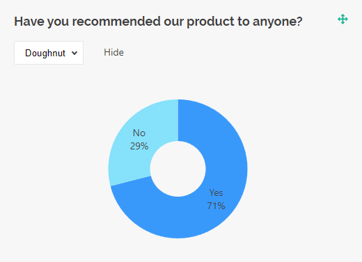
Doughnut Chart
A doughnut chart is a pie chart but with a blank center. This shape may help reduce visual clutter and draw viewer's attention to the length of the arc rather than the area of the slices.
Doughnut charts are supported by the following question types:
- Radio Button Group
- Checkboxes
- Dropdown
- Multi-Select Dropdown (Tag Box)
- Image Picker
- Yes/No (Boolean)
- Ranking
- Any of these question types used within a Multi-Select Matrix, Dynamic Matrix, or Dynamic Panel
Histogram
A histogram is a chart type that visualizes the distribution of a dataset. It divides a continuous data range into intervals and shows how many data points fall within each interval. Histograms support both vertical and horizontal views.
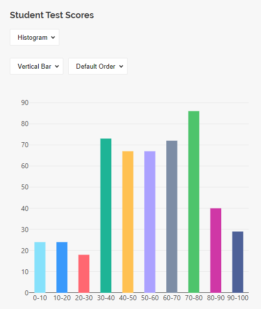
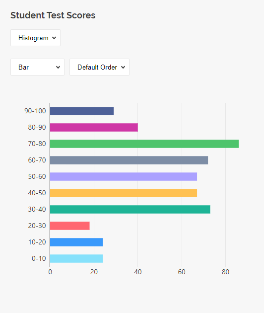
Histograms are supported by the following question types:
- Single-Line Input with
inputTypeset to"number","date", or"datetime" - Rating Scale
- Any of these question types used within a Multi-Select Matrix, Dynamic Matrix, or Dynamic Panel
Gauge Chart
A gauge chart displays a single average value of a dataset using a semicircular dial. The filled arc represents the current value's position along the scale, and the exact number is shown prominently at the center.
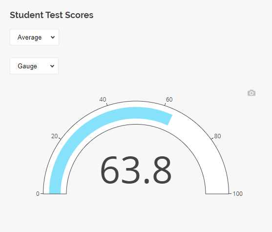
Gauge charts are supported by the following question types:
- Single-Line Input with
inputTypeset to"number" - Rating Scale
- Expression
- Any of these question types used within a Multi-Select Matrix, Dynamic Matrix, or Dynamic Panel
Bullet Chart
A bullet chart visualizes a single number on a horizontal strip. Similar to a gauge, it displays the average of a dataset, with the value indicated by a bar. The strip displays scale marks along its length.
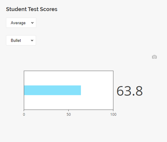
Bullet charts are supported by the following question types:
- Single-Line Input with
inputTypeset to"number" - Rating Scale
- Expression
- Any of these question types used within a Multi-Select Matrix, Dynamic Matrix, or Dynamic Panel
Radar Chart / Spider Chart
A radar chart, also known as "spider chart" or "web chart", displays multivariate data as a two-dimensional chart in which multiple axes are arranged in a circle and radiate from the same central point. Each data point is plotted on its corresponding axis, and the points are connected to form a polygon. Radar charts provide a quick and intuitive way to compare values across different variables, making it easy to identify strengths and weaknesses at a glance.
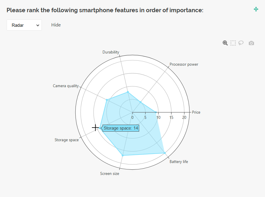
Radar charts are supported by the following question types:
Stacked Bar Chart
A stacked bar chart displays each bar divided into multiple segments that visualize the percentage contribution of each category. The total length of bars represents 100%. Stacked bar charts are useful for showing the breakdown of a total into its individual components.
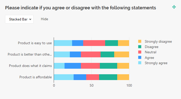
Stacked bar charts are supported by the following question types:
Word Cloud
A word cloud (also "text cloud" or "tag cloud") visualizes textual data by adjusting word size based on frequency. More frequent words appear larger, which makes the key terms easy to identify. Word clouds are useful for summarizing large text datasets and providing a quick, visual overview of the most prominent terms.
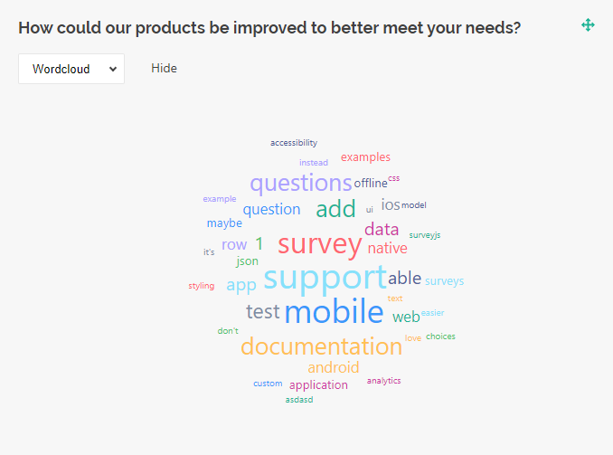
Word clouds are supported by the following question types:
- Single-Line Input
- Long Text
- Multiple Textboxes
- Any of these question types used within a Multi-Select Matrix, Dynamic Matrix, or Dynamic Panel
Text Table
A text table is a visualization type that displays textual data in a simple table, without applying any data aggregation.
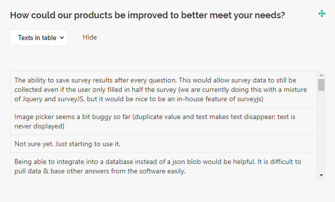
Text tables are supported by the following question types:
- Single-Line Input
- Long Text
- Multiple Textboxes
- Any of these question types used within a Multi-Select Matrix, Dynamic Matrix, or Dynamic Panel
Statistics Table
A statistics table is a visualization type that aggregates data from single- and multi-select questions and displays it in a tabular format.
Statistics tables are supported by the following question types:
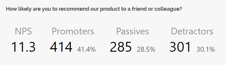
NPS Visualizer
An NPS visualizer is a chart designed specifically for Net Promoter Score (NPS) questions. NPS measures customer loyalty and identifies business growth opportunities. Respondents rate how likely they are to recommend your product or service on a scale from 0 to 10.
- Promoters (score 9-10) are most likely keep buying your product and bring new customers.
- Passives (score 7-8) are overall satisfied with your product but may switch to your competitors if they come across a more attractive offering.
- Detractors (score 0-6) are unhappy with your product and may damage your brand through negative word-of-mouth.
To calculate the NPS, the percentage of detractors should be subtracted from that of promoters.
The NPS visualizer is supported only by Rating Scale questions, standalone or used within a Multi-Select Matrix, Dynamic Matrix, or Dynamic Panel. This visualizer is disabled by default. To enable it, set the type property to "nps" for the dashboard item associated with the NPS question:
import { Dashboard } from "survey-analytics";
// ...
// Omitted: Data loading and `SurveyModel` initialization
// ...
const dashboard = new Dashboard({
  questions: survey.getAllQuestions(),
  data: dataFromServer,
  items: [{
    name: "nps_score",
    type: "nps"
  },
  // ...
  ]
});
If you want the NPS visualization to be available for selection without making it the default, add "nps" to the availableTypes array of the NPS dashboard item:
import { Dashboard } from "survey-analytics";
// ...
// Omitted: Data loading and `SurveyModel` initialization
// ...
const dashboard = new Dashboard({
  questions: survey.getAllQuestions(),
  data: dataFromServer,
  items: [{
    name: "nps_score",
    availableTypes: ["bar", "vbar", "pie", "doughnut", "gauge", "bullet", "nps"]
  },
  // ...
  ]
});
Response Count
The response count visualization displays the total number of submitted responses in the dataset. It presents a single aggregated value, making it useful for quickly assessing dataset size.

To include this visualization in the dashboard, add an object with the type property set to "responsecount" to the items array. You can also specify a custom title:
import { Dashboard } from "survey-analytics";
// ...
// Omitted: Data loading and `SurveyModel` initialization
// ...
const dashboard = new Dashboard({
  questions: survey.getAllQuestions(),
  data: dataFromServer,
  items: [
    // ...
    { type: "responsecount", title: "Total responses" },
    // ...
  ]
});
Pivot Chart
A pivot chart visualizes aggregated data across multiple dimensions, enabling multidimensional analysis. It groups data into categories and series, applies aggregation functions (such as count, sum, or average), and renders the results as an interactive chart. Users can dynamically reconfigure dimensions and aggregation settings to explore patterns, compare segments, and identify correlations within the dataset.
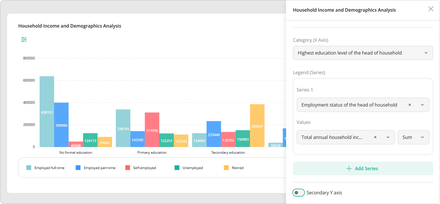
To add a pivot chart to the Dashboard, include a dashboard item with the type property set to "pivot". Specify the item's name and title, and provide the set of survey questions available for user selection via the questions array:
import { Dashboard } from "survey-analytics";
// ...
// Omitted: Data loading and `SurveyModel` initialization
// ...
const dashboard = new Dashboard({
  data: dataFromServer,
  items: [{
    name: "pivot-chart",
    type: "pivot",
    title: "Household Income and Demographics Analysis",
    questions: survey.getAllQuestions()
  }]
});
Send feedback to the SurveyJS team
Need help? Visit our support page