Major Updates 2024
We are super excited to announce the release of SurveyJS v2.0! This update primarily focuses on Survey Creator, bringing a host of enhancements, but we remain committed to improving all our libraries in 2025.
Survey Creator
Dynamic Appearance Customization
The new Survey Creator interface is now highly customizable, allowing you to align its look with the overall design of your application and your personal preferences. Key enhancements are detailed below.
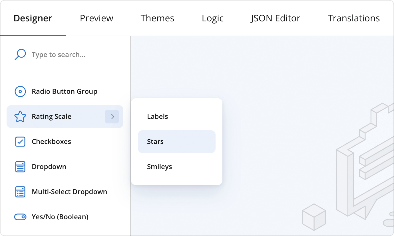
New UI Themes
The form builder interface now offers four themes that define its overall aesthetic: the original classic theme, along with new light, dark, and high contrast themes. These options allow you to customize the interface to match your visual preferences and create a comfortable working environment. Whether you prefer a bright and clear interface or a darker, eye-friendly mode, the form builder adapts to your needs.
Background and Accent Colors
Customize the background of the design surface to create a workspace that visually complements the forms you are building. Adjust accent colors within the form builder to highlight key elements and create a cohesive color scheme. This level of personalization helps ensure that the builder interface feels integrated with your brand.
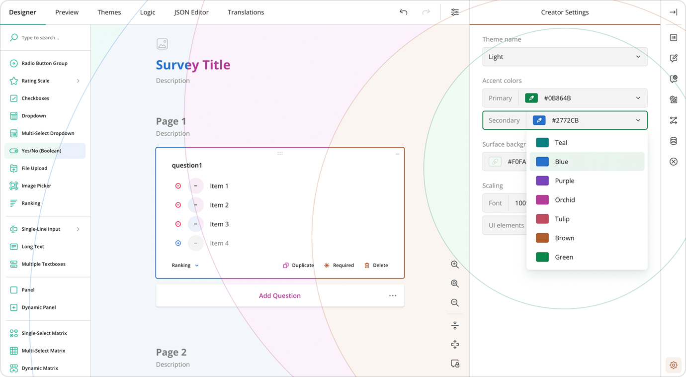
View Appearance Customization Demo
Scaling
Modify the size percentage of the form builder, including font size. This feature allows you to optimize the interface for different screen sizes or personal preferences, ensuring that everything is just the right size.
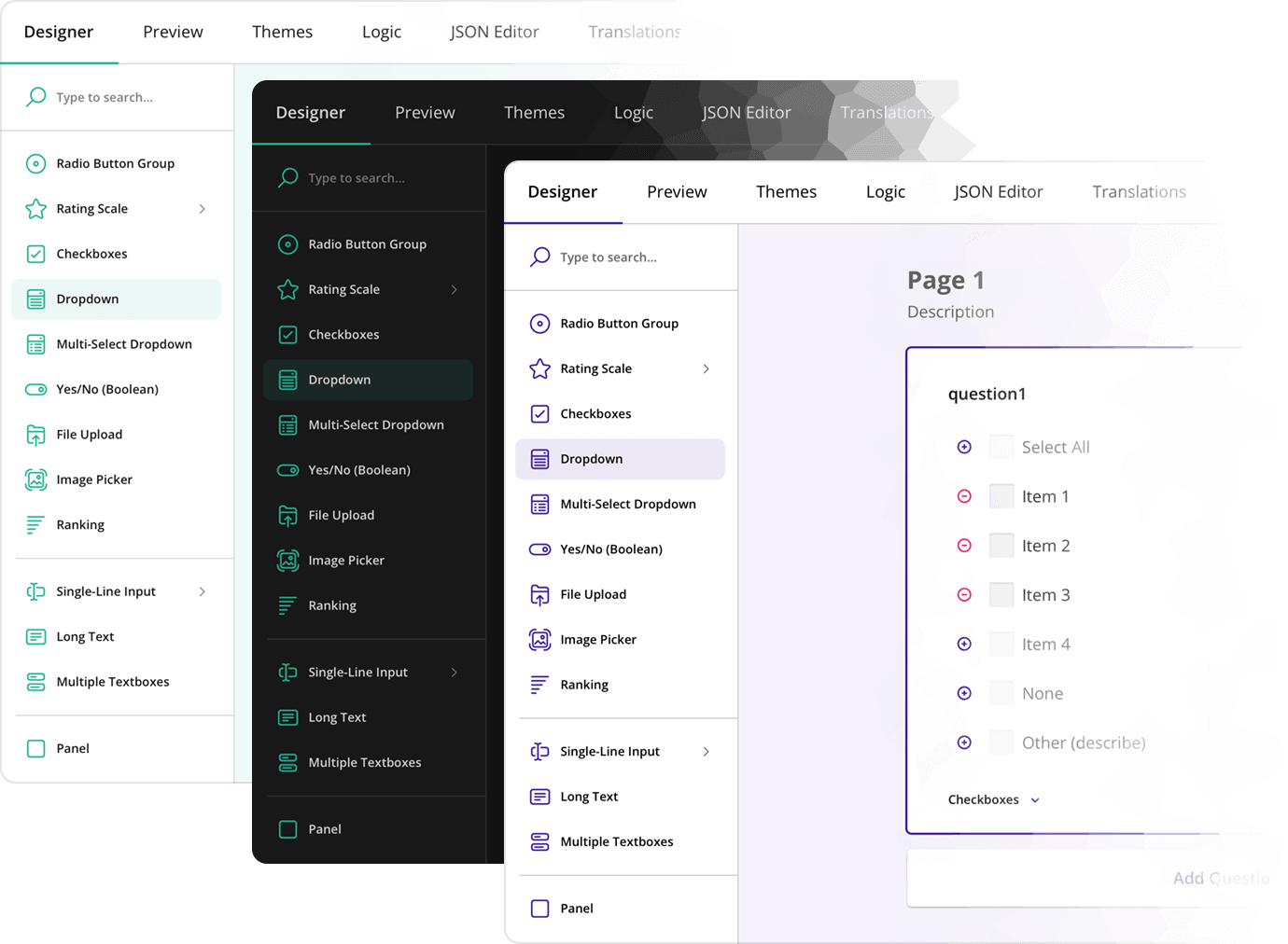
Updated Toolbox
The Toolbox, where users can easily access and drag-and-drop form elements, has been redesigned for better organization and accessibility. The cleaner layout and the addition of a search bar make it easier to find and use the components you need.
The Toolbox now also supports question subitems. Hovering over the main toolbox item reveals its subitems, and a new API enables their full customization.
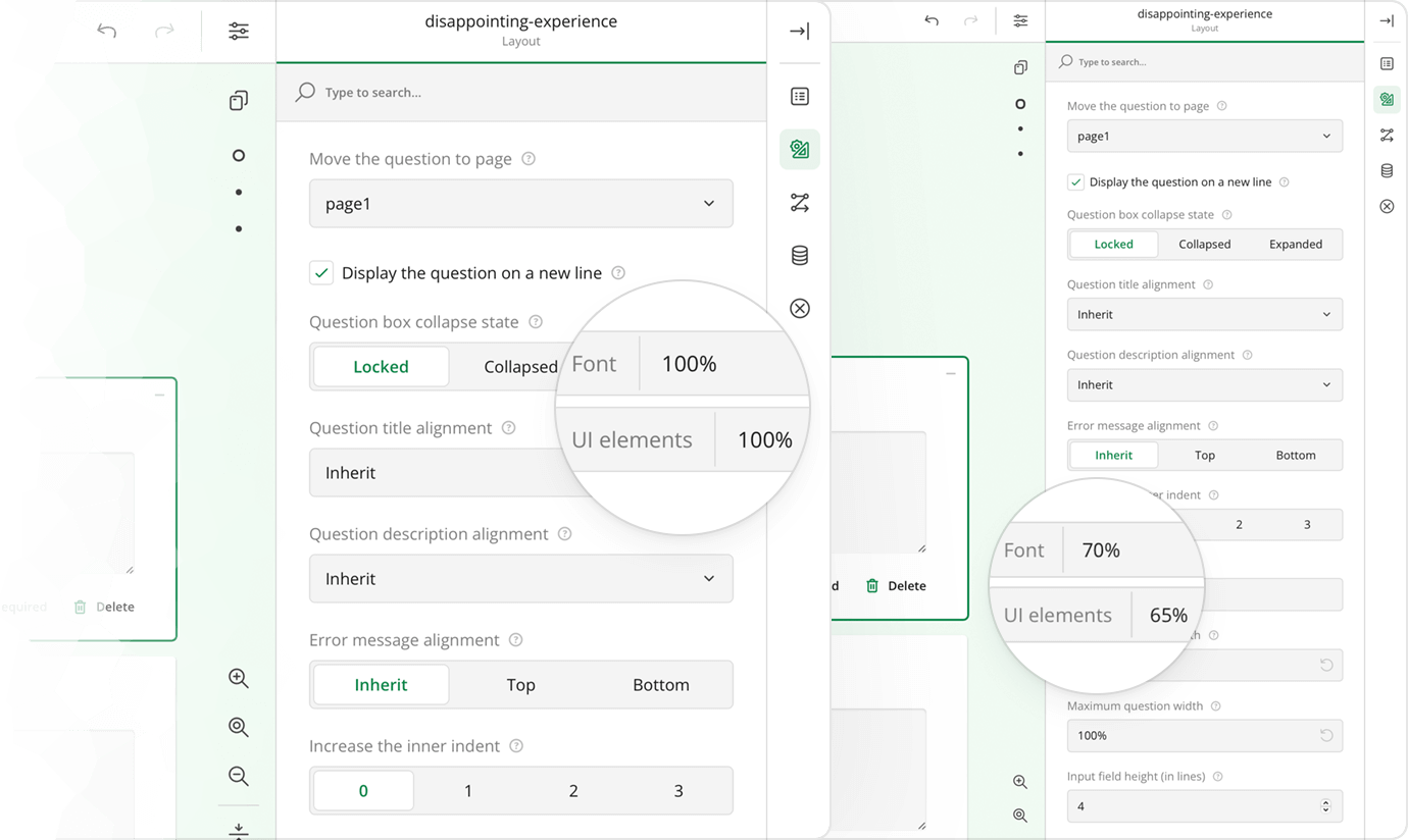
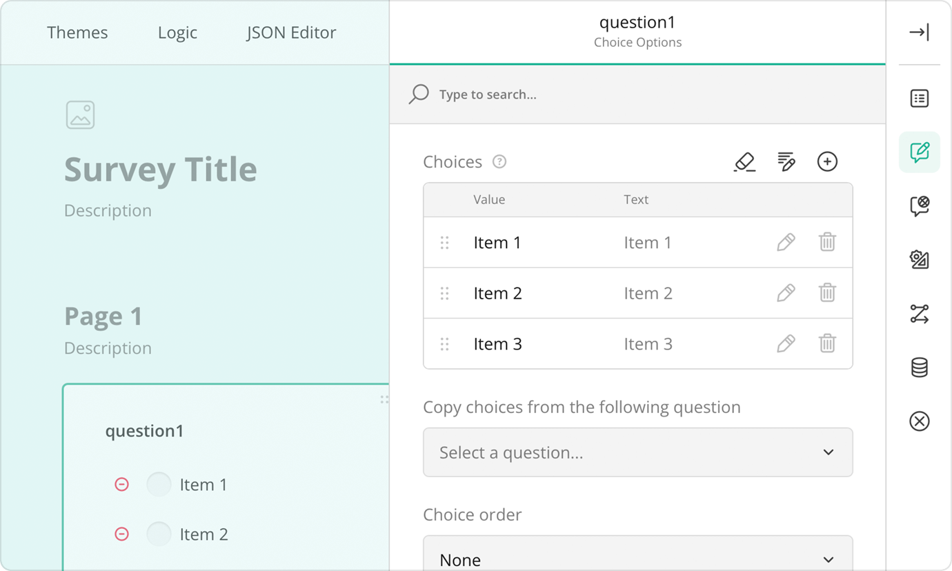
Redesigned Property Grid
The Property Grid has undergone a significant makeover to improve user experience and streamline the form-building process. You can now collapse the grid into an icon view, where each icon represents a different settings category. A click on an icon reveals only the settings for that category, automatically closing the previous one. This keeps the Property Grid clean and uncluttered and allows users to concentrate on a single category at a time.
Animation Effects
We've introduced animation effects that enhance fluidity and visual appeal across the Survey Creator interface and forms. These include interactive UI animations, smooth transitions for survey elements, and hover effects for better feedback. The File Upload question's preview carousel now has seamless side-to-side transitions, and smooth scrolling improves form navigation by reducing jarring jumps.
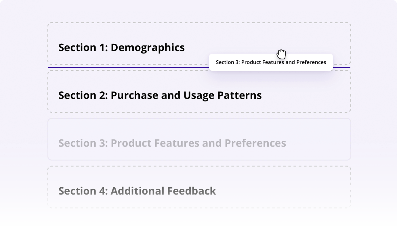
Expand/Collapse Pages and Panels to Reposition Form Elements
When working on a complex survey, effortlessly repositioning elements is crucial. With this new feature, all pages automatically collapse when you start dragging a page to reposition it. Similarly, when moving a question or panel from one page to another, pages collapse to give you a clearer view of the survey structure. As you drag an element over a target page, it expands, allowing you to see its layout and choose the perfect spot for placement. This improvement ensures a smoother experience when reorganizing your survey, eliminating the need to manually repositioning survey elements using the dedicated settings from the Property Grid.
In addition, you can now expand and collapse survey elements using individual Expand/Collapse buttons and the Collapse All and Expand All buttons. When collapsing or expanding all elements, you can also enable the Lock Question State button. In this case, the Collapse All and Expand All buttons will be collapsing and expanding only pages and panels, persisting the questions' state.
New Icons
The form builder's interface now boasts a set of stylish, modern icons that bring a fresh look to the entire UI. These icons are not only visually appealing but also designed to improve the overall user experience by making navigation and tool identification quicker and more intuitive.
Other Enhancements
Throughout 2024, Survey Creator also received many smaller improvements that significantly enhanced its look and feel:
- The device list in the Preview tab was updated with most recent devices, and a new
previewDeviceproperty was added to let you set a different default device. - The Property Grid is now more manageable and ensures only one category of settings is expanded at a time. We also added numerous hint texts to help survey creators better understand the purpose and function of specific properties.
- A more intuitive design for empty pages and tabs enhances the editing experience.
- A new design for questions that load choices from the web (
choicesByUrlproperty). - Our form theme editor now offers two modes for properties related to form appearance customization: Basic and Advanced, allowing users to gradually get to know the tool and its ample features.
Form Library
Our Form Library also received significant enhancements described below.
Input Masks
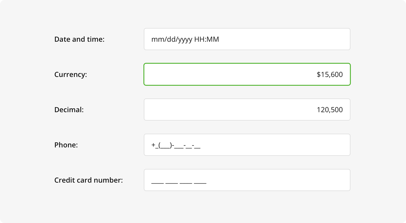
Single-Line Input and Multiple Textboxes questions now support input masking. This feature helps maintain data consistency by preventing users from entering data in incorrect formats. Currently, supported input mask types include numeric, currency, date and time, and pattern.
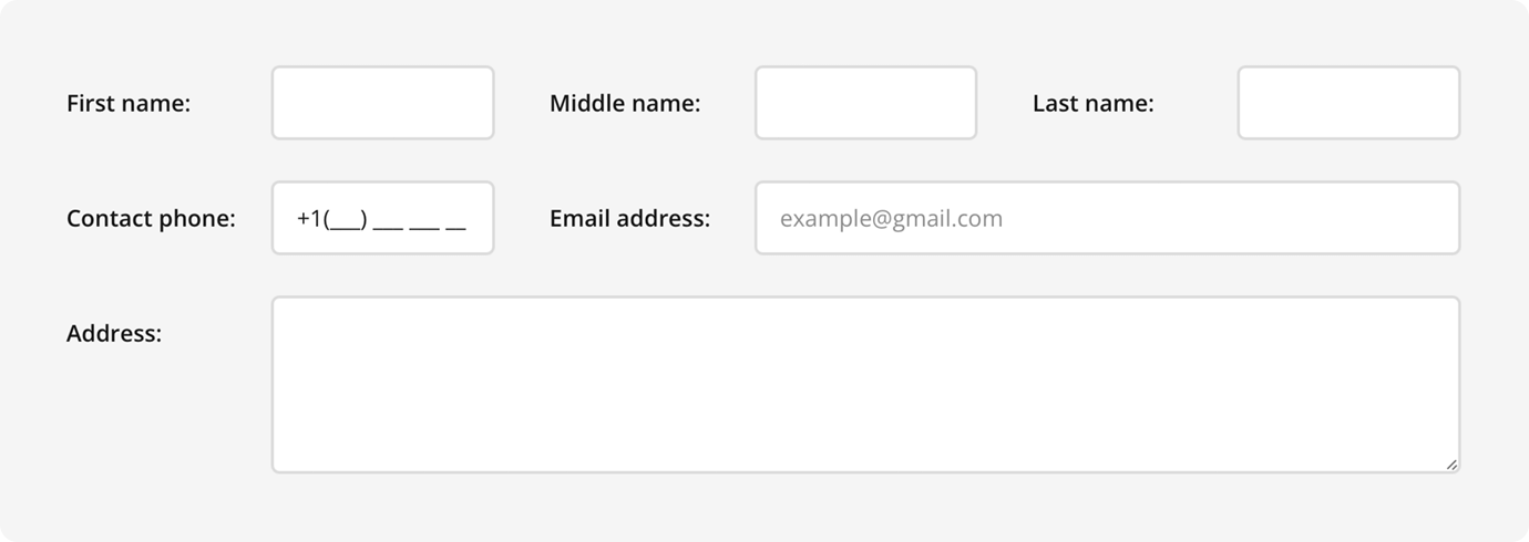
Vertical Input Fields Alignment
A new questionTitleWidth property allows users to maintain a neat and compact form layout by aligning input fields vertically within a page or panel. Previously, when users left-aligned question titles, the input fields often appeared untidy and asymmetrical due to varying title lengths. With this new property, users can set a fixed width for question titles, ensuring neatly aligned fields.
Other Enhancements
In addition to these major improvements, we've introduced several refinements to enhance usability:
- A new progress bar UI with buttons for page navigation and more placement options. It is now sticky by default to stay visible in long surveys.
- Pop-up surveys have a redesigned UI and now support full-screen mode with a maximize/restore button.
- New animations enhance the survey-taking experience, including effects for expanding/collapsing questions and panels, ranking item drag, dropdowns, and dynamic panels/matrix questions.
- Read-only and preview modes received a fresh look for better readability, with improved accessibility features, such as keyboard navigation for form fields.
Dashboard
SurveyJS Dashboard received the following enhancements.
New Data Visualizers
Our Dashboard Library now features a set of new data visualizers designed to enhance the display and analysis of survey data.
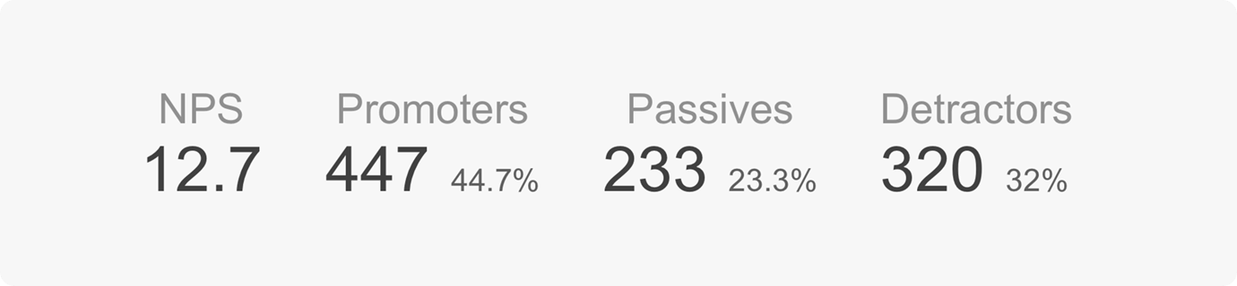
NPS Visualizer
A dedicated visualizer to showcase NPS scores, along with detailed breakdowns of promoters, passives, and detractors.
Statistics Table
A statistics table aggregates data from a Radio Button Group, Checkboxes, or Dropdown question and displays the result in a tabular format.
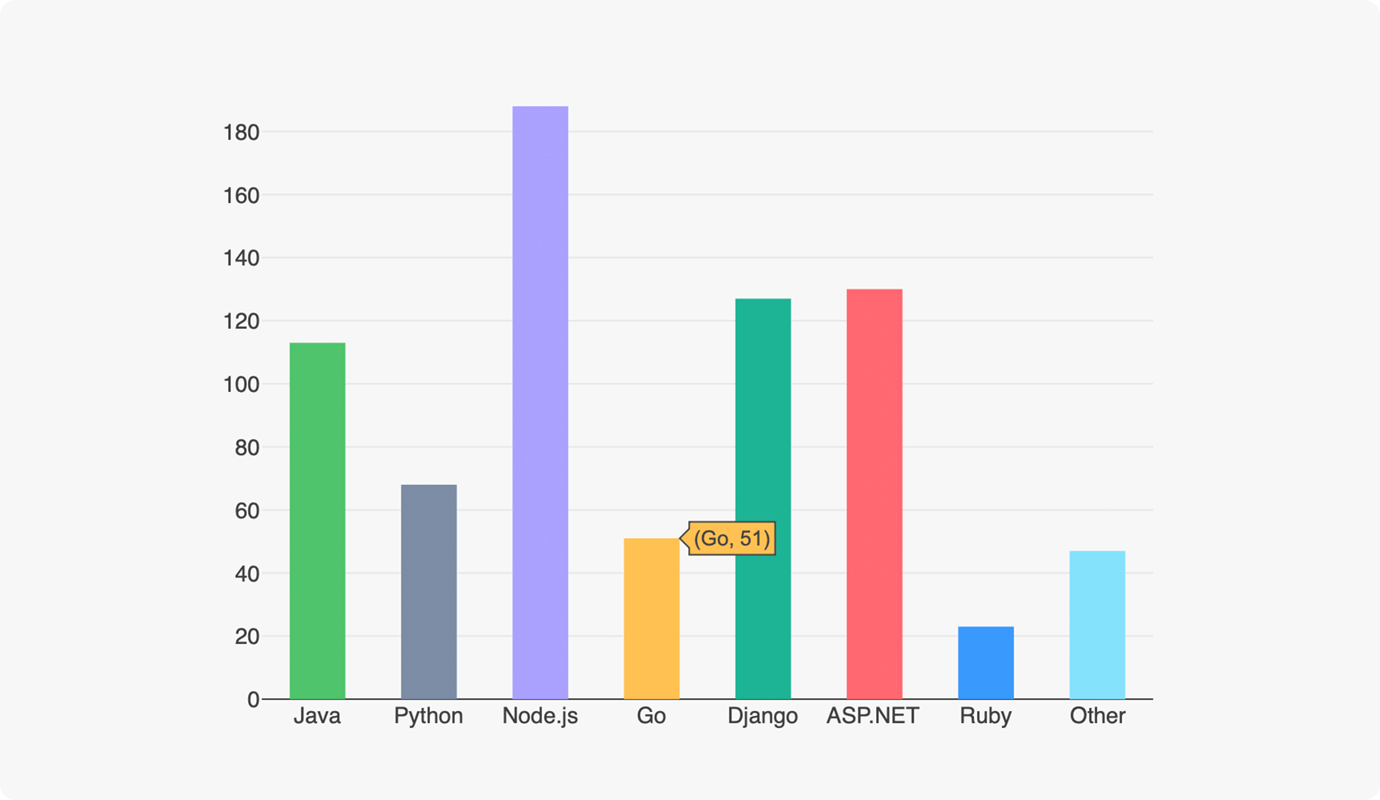
Vertical Bar Chart
A vertical bar chart visualizes categorical data with rectangular bars. The length of each bar is proportional to the value it represents. Previously, this chart type was available for continuous data. This release adds support for discrete data as well.
New API for Server-Side Data Handling
We released a new API for server-side data handling that enables pagination, filtering, and sorting on a web server, reducing performance demands.
Improved Word Cloud Implementation
The new word cloud is now built directly into the Dashboard library, removing the previous dependency on wordcloud2.js.
What Else?
Native Support for ES Modules
SurveyJS v2.0 packages include ES modules that can be used directly, without being auto-converted from UMD modules by a transpiler. If your application uses ESM imports, the ES modules will be used automatically after you upgrade to SurveyJS v2.0.
Although the introduction of ES modules is a noticeable enhancement, it is only the first step towards SurveyJS module optimization. In future releases, we'll be working on decoupling our source code to make tree shaking and dead code elimination possible.
Transition from Knockout to Vanilla JavaScript Packages
In this significant shift, we've moved away from using the SurveyJS Form Library for Knockout in our examples, including the full-featured demo. This decision reflects our commitment to modernizing our tools and improving accessibility for a broader range of developers.
Why We Moved Away from Knockout
Knockout has long been appreciated for its simplicity and ease of use, making it a go-to choice for beginners and smaller projects. However, as the web development landscape has evolved, so have the needs and expectations of our users. The Knockout framework, while straightforward, lacks the flexibility and modern features that are now standard in more contemporary frameworks like React. By moving away from Knockout, we're aligning our offerings with current industry standards and ensuring that our tools remain relevant and powerful.
Introducing Two New Vanilla JavaScript Packages
To replace the Knockout-based library, we've introduced two new packages built with Preact:
These packages use Preact, providing a lightweight, framework-agnostic solution that can be seamlessly integrated into any project. By offering these vanilla JS packages, we give developers the flexibility to use our tools in a way that best suits their projects, without being tied to a specific framework.
Although Knockout was once a great starting point for beginners, we believe these new Preact-based packages offer even greater accessibility. They are designed to be intuitive and easy to work with, even for those new to web development. Additionally, they provide the flexibility to scale and integrate with modern frameworks as developers' needs grow.
Refer to the following tutorials to get started with the new bundles in a vanilla JavaScript application:
Add a Survey to a JavaScript Application
Add Survey Creator / Form Builder to a JavaScript Application
Modular Component Registration for Vue 3
In 2024, we introduced a new, more flexible way to integrate SurveyJS components into Vue 3 applications. Previously, developers had to use surveyPlugin and register our libraries globally, making SurveyJS components available throughout the entire application. This approach, while convenient, resulted in the entire survey library being loaded upfront, which could lead to larger initial load times.
With the new method, developers can now opt to import and register SurveyJS components on a per-need basis:
// Form Library
import { SurveyComponent } from "survey-vue3-ui";
// Survey Creator
import { SurveyCreatorComponent } from "survey-creator-vue";
This allows developers to load SurveyJS components only in specific parts of their application, rather than globally. For example, if a certain survey is only needed on a specific page or within a particular component, the survey component can be imported and used only there. This modular approach enables developers to break down their applications into chunks, loading components dynamically as users navigate through the app.
This change not only reduces the initial load time of applications but also gives developers greater control over how and when different parts of the SurveyJS library are loaded. By leveraging this feature, developers can ensure that their applications remain lightweight and responsive, even as they grow in complexity.
npm Packages are now peerDependencies
SurveyJS npm packages were moved from dependencies to peerDependencies, ensuring only one instance of each dependency package is included.