SurveyJS v3.0: Build Interactive Dashboards with Cross-Filtering, Date Filters, and Declarative Configuration
TL;DR: SurveyJS v3.0 introduces a redesigned Dashboard with Chart.js as the default charting engine, cross-filtering between visualizations, built-in date range filters, configurable pivot charts, and a declarative API that defines the entire dashboard through one options object. Users can change chart types, sort answers, hide series, and rearrange dashboard items. You can capture those changes as dashboard state, save them in your own storage, and restore a persistent dashboard for each user or role.
Displaying survey results is easy when a form contains three questions and collects a few dozen responses.
It becomes a different problem when the form grows to include ratings, matrices, dynamic panels, free-text fields, dates, and calculated values. A single chart no longer answers the important questions. Users need to compare segments, isolate time periods, change how results are visualized, and move between a high-level overview and individual response records.
At that point, a dashboard cannot be a static collection of charts assembled once by a developer.
It needs to function as an analysis tool.
SurveyJS v3.0 redesigns Dashboard around that idea. Visualizations now work together instead of as isolated widgets. Users can select a value in one chart to filter the rest of the dashboard, apply date ranges, change chart types, sort results, toggle series, and reorganize the layout.
The configuration model has changed as well. Instead of creating and modifying individual visualizers through a sequence of API calls, you can define the dashboard declaratively with a single options object.
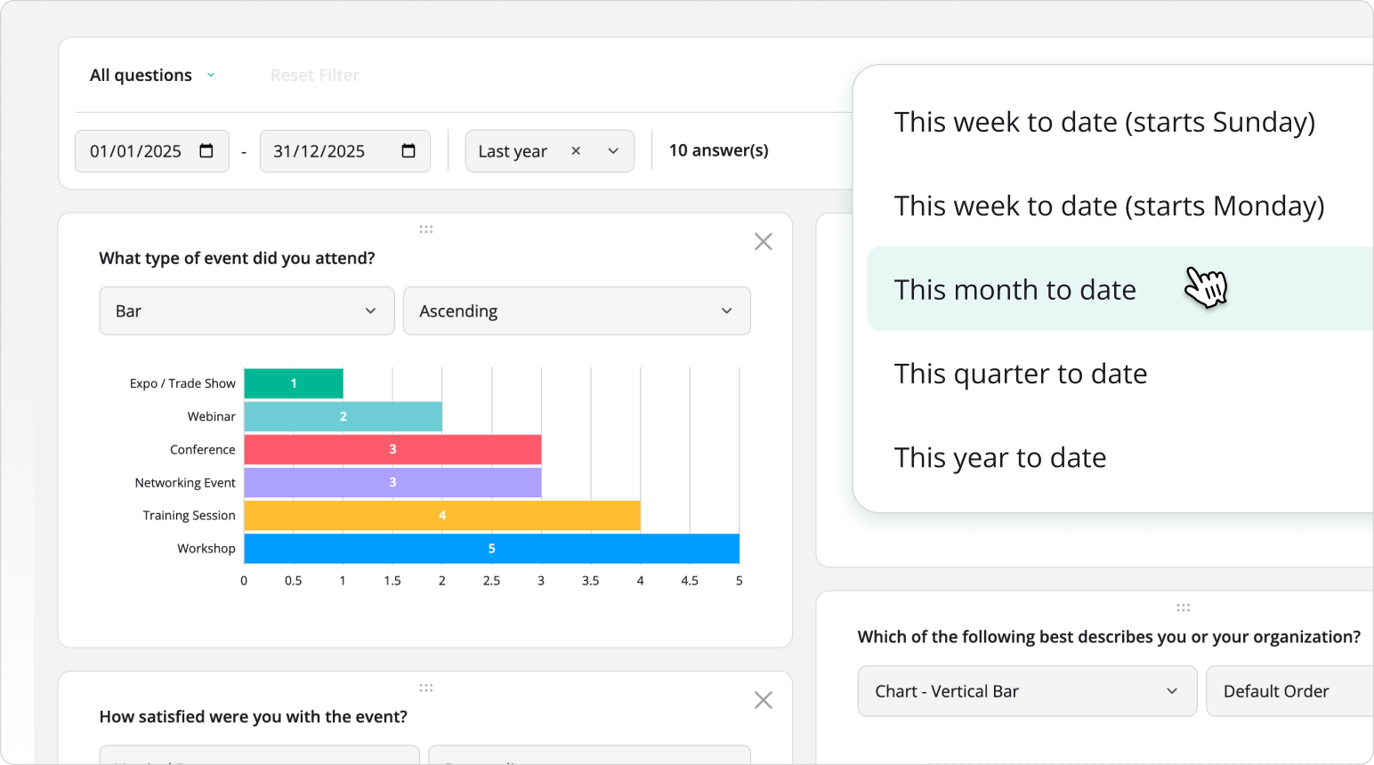
One Form Schema for Data Collection and Analysis
SurveyJS Dashboard uses two inputs:
- A SurveyJS JSON form definition
- An array of response objects collected with that form
The form definition tells Dashboard what each value means.
A Radio Button Group contains categories. A Rating Scale contains ordered numeric values. A Long Text question contains free-form text. A matrix contains rows and columns that require a different aggregation model.
Dashboard reads that structure and selects an appropriate visualization for each question.
import { Model } from "survey-core";
import { Dashboard } from "survey-analytics";

const surveyJson = {
  elements: [
    {
      type: "radiogroup",
      name: "department",
      title: "Which department do you work in?",
      choices: ["Engineering", "Marketing", "Sales", "Support"]
    },
    {
      type: "rating",
      name: "satisfaction",
      title: "How satisfied are you with your work environment?",
      rateMin: 1,
      rateMax: 5
    },
    {
      type: "comment",
      name: "feedback",
      title: "What should we improve?"
    }
  ]
};

const surveyResults = [
  { department: "Engineering", satisfaction: 4, feedback: "More meeting-free time" },
  { department: "Marketing", satisfaction: 3, feedback: "Clearer quarterly priorities" },
  { department: "Engineering", satisfaction: 5, feedback: "No changes" }
];

const survey = new Model(surveyJson);

const dashboard = new Dashboard({
  questions: survey.getAllQuestions(),
  data: surveyResults
});

dashboard.render("dashboard");
You do not need to transform every question into a separate chart configuration before Dashboard can display it.
The same question names used as keys in the response objects connect the schema to the collected data. Dashboard uses the question types, titles, choices, and other metadata from the form definition to construct the initial visualizations.
This keeps collection and analysis aligned. When the form schema changes, the dashboard can interpret the updated structure without a separate analytics schema that has to be maintained by hand.
A New Declarative Dashboard API
Previous Dashboard configurations often grew as a series of instructions: create the panel, locate a visualizer, change its type, modify its options, register an event, and then repeat the process for the next item.
SurveyJS v3.0 introduces a new Dashboard class built around a declarative IDashboardOptions object.
The object can define response data, survey questions, dashboard items, item order, visualization types, available alternatives, per-item settings, cross-filtering, date filtering, legend position, layout behavior, and other dashboard-wide options.
const dashboard = new Dashboard({
  questions: survey.getAllQuestions(),
  data: surveyResults,
  allowSelection: true,
  items: [
    {
      name: "department",
      type: "pie",
      title: "Responses by Department",
      availableTypes: ["bar", "vbar", "pie", "doughnut"]
    },
    {
      name: "satisfaction",
      type: "gauge",
      title: "Average Satisfaction",
      availableTypes: ["gauge", "bullet", "bar"]
    },
    {
      name: "feedback",
      type: "wordcloud",
      title: "Common Feedback Topics"
    }
  ]
});
The items array controls which visualizations appear and in what order. Each item connects to a survey question through its name. You can set the initial visualization with type, provide a custom title, and define which alternative types users may select.
This configuration can remain in application code, come from your backend, or be stored as JSON alongside the form definition.
Auto-Generate Items or Define Them Explicitly
You do not have to configure every dashboard item manually.
When you pass survey questions to the questions option, Dashboard can generate items automatically. Each generated item inherits the question's name and title, receives a suitable default visualization, and gets a list of compatible alternative types.
const dashboard = new Dashboard({
  questions: survey.getAllQuestions(),
  data: surveyResults
});
This is useful when forms change frequently or users create them dynamically in Survey Creator. A new question can appear in the dashboard without a developer adding another chart definition.
You can combine automatic generation with explicit overrides:
const dashboard = new Dashboard({
  questions: survey.getAllQuestions(),
  data: surveyResults,
  items: [
    "department",
    {
      name: "satisfaction",
      type: "gauge",
      title: "Employee Satisfaction"
    },
    "feedback"
  ]
});
Here, department and feedback use their automatically generated configurations. The satisfaction item keeps the question metadata but overrides the visualization type and title.
Use automatic generation when the dashboard should follow the form schema. Use explicit item objects when a visualization has a fixed analytical purpose or needs controlled settings.
Chart.js Is Now the Default Charting Engine
SurveyJS Dashboard separates its analytics and interaction layer from the charting engine that renders the final graphics.
SurveyJS v3.0 supports two engines:
Chart.js is now the default.
The survey-analytics package supplies the Dashboard UI, question-to-visualization logic, aggregation, filtering, state management, and layout behavior. A chart adapter passes the calculated data to the active charting library.
This separation means Dashboard's public API does not depend on one chart vendor.
You can use Chart.js for the standard installation and switch to Plotly.js through its dedicated package entry points when a project requires engine-specific capabilities. The Dashboard configuration model remains the same.
Chart.js covers the main built-in visualization types, including horizontal and vertical bar charts, stacked bars, pie and doughnut charts, histograms, gauges, bullet charts, radar charts, NPS visualizations, and pivot charts.
Dashboard also includes non-chart visualizers such as word clouds, response counters, text tables, and statistics tables.
The important change is not simply the new default library. Chart rendering is now treated as an interchangeable layer rather than the foundation of the Dashboard API.
Cross-Filter the Entire Dashboard from One Chart
A dashboard becomes substantially more useful when visualizations can answer questions about each other.
Suppose an employee survey contains charts for department, satisfaction, preferred work arrangement, and likelihood to recommend the company.
The overall satisfaction score gives you one result. It does not tell you whether Engineering and Sales responded differently.
With cross-filtering enabled, a user can select Engineering in the department chart. Every other dashboard item recalculates from responses where department equals "Engineering".
The satisfaction chart now shows Engineering satisfaction. The work-arrangement chart shows Engineering preferences. The NPS item shows the score for the same segment.
Users can select values in multiple visualizations to narrow the dataset further. Each selection becomes part of the active filter. Dashboard applies the combined conditions to the underlying response collection and updates the affected visualizations.
This turns the dashboard into an exploratory analysis interface without requiring a separate filter control for every survey question.
Cross-Filtering in SurveyJS Dashboard
Cross-Filtering vs Series Visibility
Selecting a chart value and hiding a series are separate operations.
Cross-filtering changes the response records included in the analysis. Legend-based series toggling changes what a chart displays without changing the dataset used by the rest of the dashboard.
This distinction matters when you save dashboard state or explain the result to users:
- Cross-filter selection – Changes the active data subset.
- Legend selection – Changes the visible series in one visualization.
Filter Responses by Date
Most operational dashboards need a time boundary.
A customer satisfaction score across three years may say little about the current experience. A compliance dashboard may need to show this quarter only. A team lead may want to compare the last seven days with the previous month.
SurveyJS v3.0 includes a built-in date panel with start and end date editors, predefined periods, an option to include or exclude the current day, and a counter that shows how many responses match the filter.
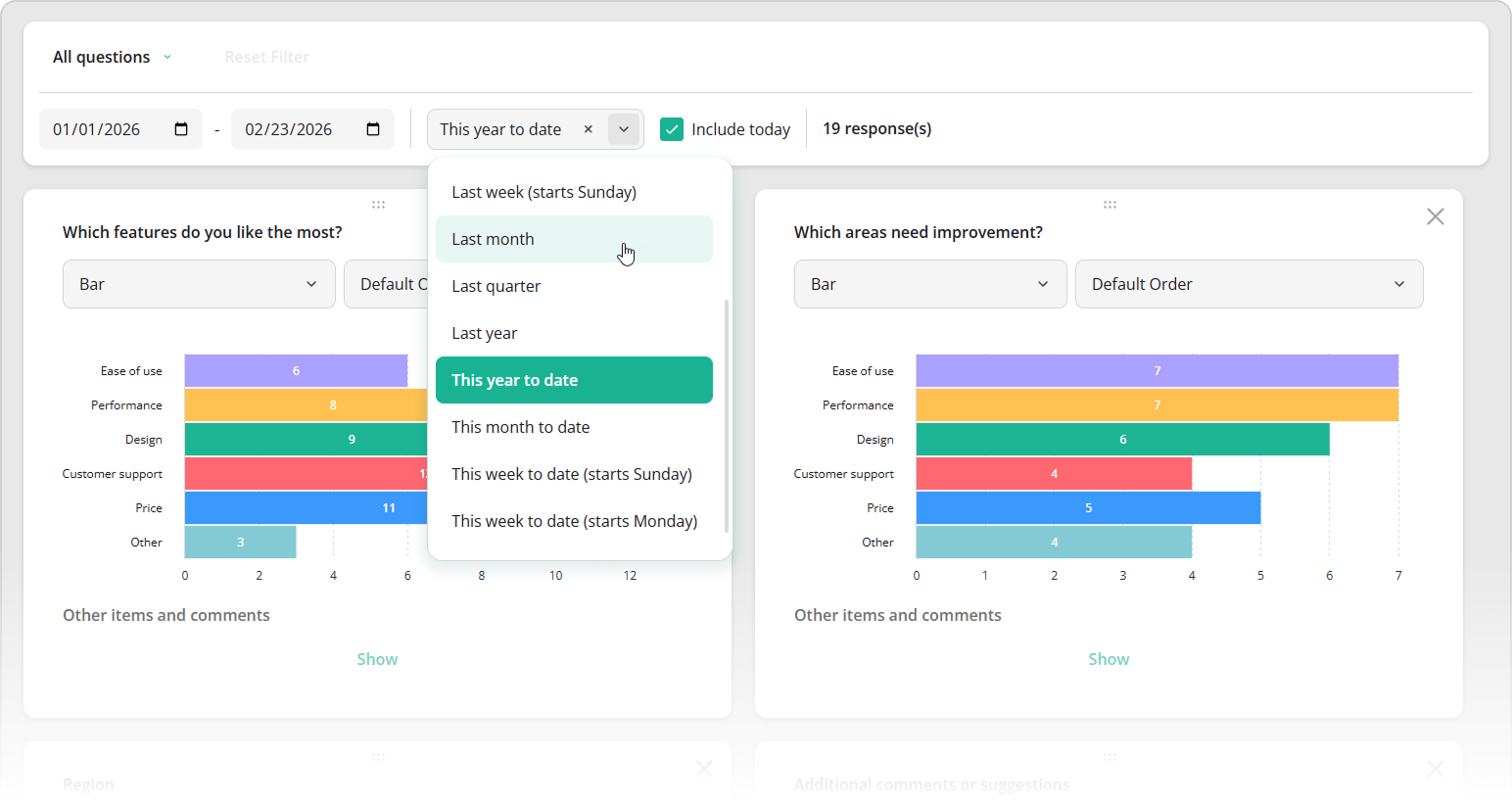
Date filtering requires a timestamp field in each response object. Assign the field name to dateFieldName:
const surveyResults = [
  {
    department: "Engineering",
    satisfaction: 4,
    timestamp: "2026-07-14T09:42:18.000Z"
  },
  {
    department: "Marketing",
    satisfaction: 3,
    timestamp: "2026-08-03T15:21:06.000Z"
  }
];

const dashboard = new Dashboard({
  questions: survey.getAllQuestions(),
  data: surveyResults,
  dateFieldName: "timestamp"
});
When dateFieldName is present, Dashboard displays the date panel automatically. The timestamp does not have to be a survey question. It can be metadata that your backend adds when it stores a response.
Configure Date Range Presets
Dashboard includes predefined relative and calendar-based periods such as Last 7 days, Last 30 days, Last month, Last quarter, and Year to date.
You can restrict the available choices to periods that make sense for your application:
const dashboard = new Dashboard({
  questions: survey.getAllQuestions(),
  data: surveyResults,
  dateFieldName: "timestamp",
  availableDatePeriods: [
    "last7days",
    "last30days",
    "lastQuarter",
    "ytd"
  ],
  datePeriod: "last30days"
});
availableDatePeriods defines what users can select. datePeriod sets the initial period.
Apply a Fixed Date Filter
Not every date filter should be editable.
Set a period or custom range and hide the date panel by setting the showDatePanel property to false:
const dashboard = new Dashboard({
  questions: survey.getAllQuestions(),
  data: surveyResults,
  dateFieldName: "timestamp",
  datePeriod: "last30days",
  showDatePanel: false
});
For an exact interval:
const dashboard = new Dashboard({
  questions: survey.getAllQuestions(),
  data: surveyResults,
  dateFieldName: "timestamp",
  dateRange: ["2026-07-01", "2026-07-31"],
  showDatePanel: false
});
Dashboard applies the filter but does not expose controls that let the user change it.
Respond to Date Filter Changes
Use onDateRangeChanged when the rest of your application needs to react to the selected period:
dashboard.onDateRangeChanged.add((_, options) => {
  const [startDate, endDate] = options.dateRange;
  const selectedPeriod = options.datePeriod;

  updateReportTitle(startDate, endDate);
  updateExportParameters({
    startDate,
    endDate,
    period: selectedPeriod
  });
});
options.dateRange contains the calculated start and end dates. options.datePeriod contains the selected preset identifier and is undefined when the user enters a custom range.
Let Users Choose the Right Visualization
The correct visualization often depends on what a user wants to learn.
A bar chart makes category differences easy to compare. A pie or doughnut chart emphasizes composition. A statistics table provides exact values. A gauge reduces a numeric result to one prominent indicator.
Dashboard can expose a chart-type selector for each item. Use availableTypes to control the choices:
const dashboard = new Dashboard({
  data: surveyResults,
  items: [
    {
      name: "department",
      type: "bar",
      availableTypes: ["bar", "vbar", "pie", "doughnut", "table"]
    }
  ]
});
If an item has one defined analytical purpose, lock its type by setting allowChangeType to false:
{
  name: "nps",
  type: "nps",
  title: "Net Promoter Score",
  allowChangeType: false
}
This gives you control over which parts of the dashboard users can explore and which should remain standardized.
Add Pivot Charts for Multi-Dimensional Analysis
A standard question chart usually groups responses by one question. A pivot chart combines dimensions. It can use one field as a category, another as a series, and a numeric field as an aggregated value.
SurveyJS v3.0 adds pivot chart support with configurable categories, multiple series, and aggregation. Use it when the analytical question combines several fields rather than summarizing one question at a time.
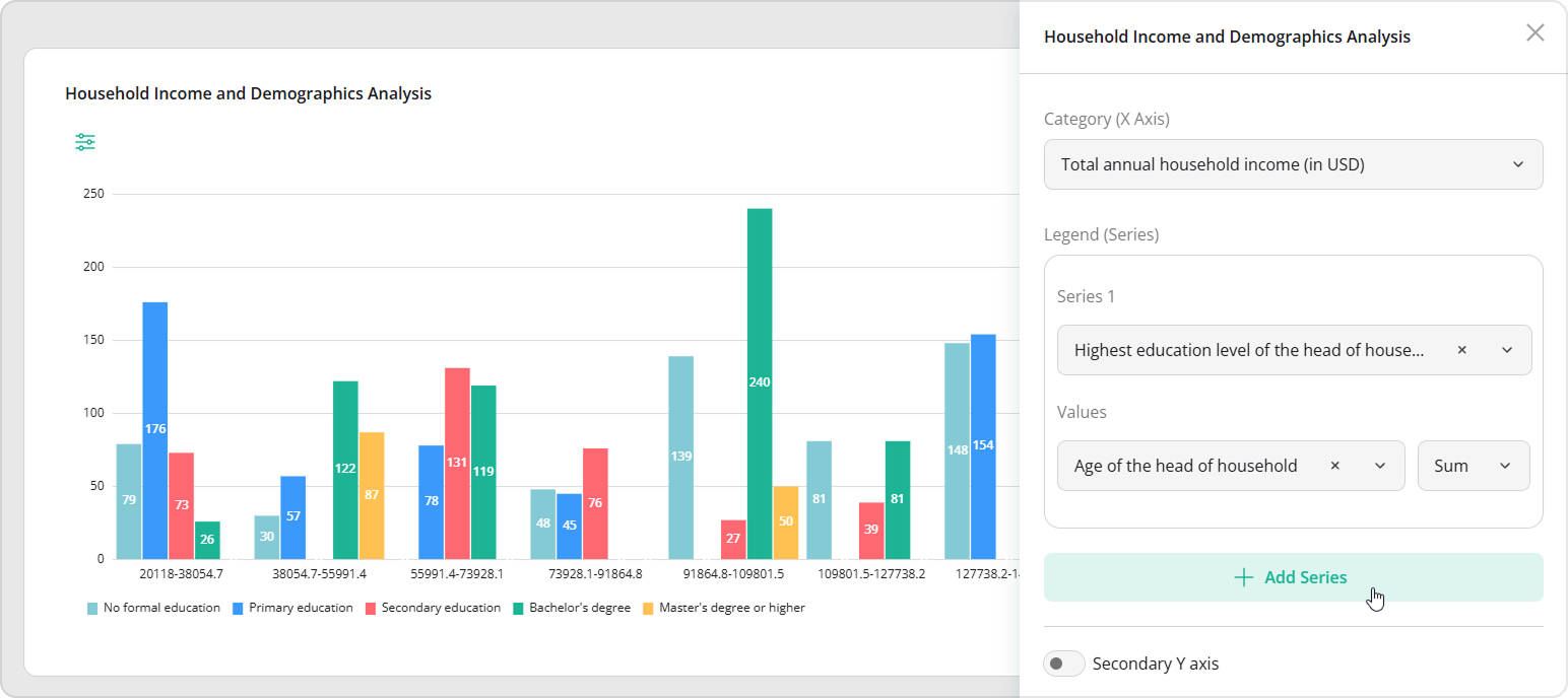
Pivot configuration belongs in the dashboard item definition, so it can be saved, reused, and delivered from your backend with the rest of the dashboard configuration.
Pivot Chart for Household Income Survey Analysis
Persist Dashboard Customizations
A configurable dashboard creates a new problem: users expect their changes to persist.
SurveyJS v3.0 represents runtime changes as dashboard state. The state includes selected visualization types, item order and dimensions, sorting settings, hidden or visible items, active filters, and other runtime customizations.
Save and Restore Dashboard State
Use onStateChanged to capture changes:
dashboard.onStateChanged.add((_, state) => {
  localStorage.setItem(
    "employee-dashboard-state",
    JSON.stringify(state)
  );
});
Restore the saved state when the dashboard is created:
const savedState = localStorage.getItem(
  "employee-dashboard-state"
);

if (savedState) {
  dashboard.state = JSON.parse(savedState);
}
For production applications, the state can be stored in your backend instead of localStorage:
dashboard.onStateChanged.add(async (_, state) => {
  await fetch(`/api/users/${userId}/dashboard-state`, {
    method: "PUT",
    headers: {
      "Content-Type": "application/json"
    },
    body: JSON.stringify(state)
  });
});
This makes the configuration available across devices and sessions.
Create and Save Dashboard Configurations
Dashboard state is not limited to remembering one user's last session. It can represent a named dashboard configuration.
The same survey data can support an executive overview, regional performance dashboard, customer satisfaction dashboard, quality-assurance dashboard, or detailed analyst workspace. Each view can begin with a different saved state.
This approach separates three resources:
- The form schema defines the data structure.
- The response collection contains the data.
- The dashboard state defines how that data is presented and analyzed.
They can be stored and versioned independently.
Apply the Same SurveyJS Theme to Dashboard
Dashboard now uses the shared SurveyJS v3.0 design token system.
The same theme object used for Form Library and Survey Creator can be applied to Dashboard:
dashboard.applyTheme(customTheme);
Or apply a predefined theme:
import { ContrastDark } from "survey-core/themes";

dashboard.applyTheme(ContrastDark);
The theme controls the Dashboard UI, including colors, surfaces, typography, controls, and other visual properties connected to SurveyJS design tokens.
The data collection and analysis interfaces can now follow the same visual system instead of looking like unrelated products.
What Changes for Existing Dashboard Integrations
The central migration is from imperative visualizer configuration to the new declarative Dashboard API.
The earlier VisualizationPanel API is now obsolete. Existing integrations should move toward:
const dashboard = new Dashboard({
  questions,
  data,
  items,
  allowSelection,
  dateFieldName
});
This does not mean every customization must become static JSON. You can still access and customize individual visualizers programmatically when a requirement falls outside the options model.
The difference is that the complete dashboard now has a stable declarative definition. Programmatic customization becomes the exception rather than the only way to assemble the interface.
A practical migration sequence is:
- Replace
VisualizationPanelwithDashboard. - Move global settings into the Dashboard options object.
- Move question selection and order into
items. - Define initial and available visualization types per item.
- Enable date filtering through top-level options.
- Capture user changes through dashboard state.
- Apply a shared SurveyJS v3.0 theme.
- Keep direct visualizer customization only where the options API does not cover the requirement.
A Dashboard Users Can Actually Analyze With
The Dashboard changes in SurveyJS v3.0 are not limited to a new visual design or a different charting library.
The product now has a clearer architecture:
- The SurveyJS schema explains the response data.
- The Dashboard options object defines the initial analysis interface.
- Chart adapters separate analytics behavior from the rendering engine.
- Cross-filtering connects visualizations into one analysis surface.
- Date filters restrict results to meaningful reporting periods.
- Runtime state captures how each user configures the dashboard.
- Shared design tokens align the dashboard with the rest of the application.
A developer can define the initial dashboard without assembling each visualizer through imperative code. A user can then explore the data without requesting a new chart or filter for every question.
The form schema remains the source of truth for the data structure. Your backend remains the source of truth for responses and permissions. Dashboard becomes the interactive layer between them.